As I have been creating new designs, I have been thinking about the process. How do I actually come up with the ideas, and then how do I shape them into something beautiful and useful?
I will talk about the overall process at a later date, but I have come up with a list of ideas to enable the design process. Not all of the ideas should be applied to each project. But they are a set of things to think about to enhance the finished item. These are those ideas in no particular order.
As with a lot of arts and crafts, the raw materials are not necessarily in exactly the colour that you need. When I used to do l pastel painting I also came across this problem. The solution, was to use one colour of pastel over another to get the required colour. This is not possible with beadwork, but as the beads are usually small, you can use one colour next to the other, your eye will blend the colours together!
This is similar to pontilism or divisionism in painting. This method actually produces a more interesting result than just using one colour.
Looking at my Pink Paisley necklace. I was limited by the colour of the superduo beads, as these come in just a few colours. I was really looking for something a little more pink, and a little more intense.
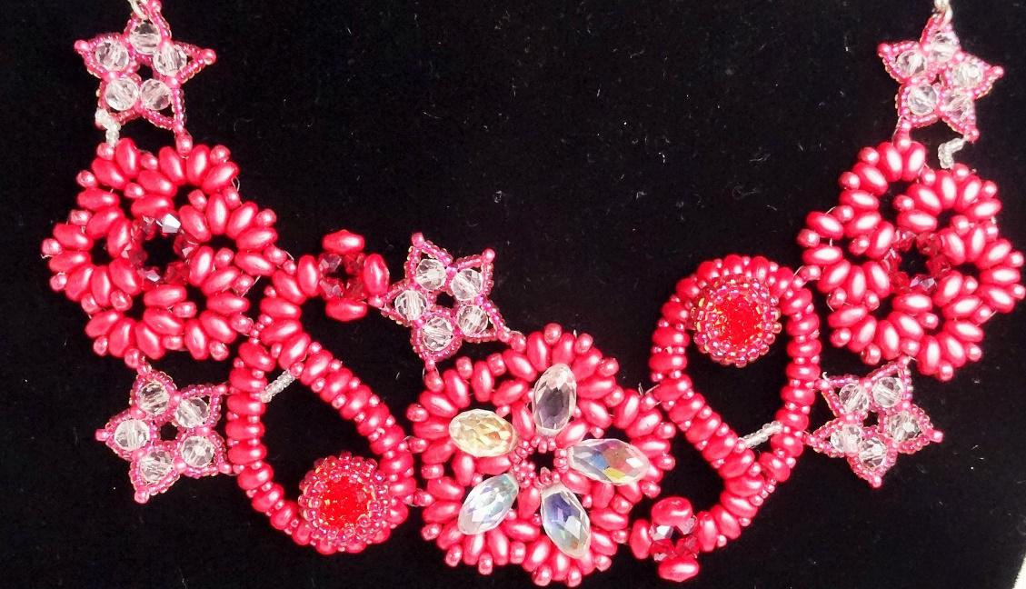
Pink Paisley Necklace
The duo beads are actually of a brick red/pink colour. So I ‘pinked’ it up by using pink metallic duracoat beads between them. I added intensity by using the hot red bicones and chatons (the large round crystals). And then cooled it down with the clear crystal beads in the stars, and the cranberry lined seed beads around them.
The overall effect is to get quite close to the shade of pink that I originally wanted. Which was to match an applique design that was making. The duller shade of cranberry around the chaton really brings out its bright colour.
Another advantage of using this approach is to make the finished item more interesting. Initially it looks like it is just one (or two) colours, but on closer inspection you notice the variations.
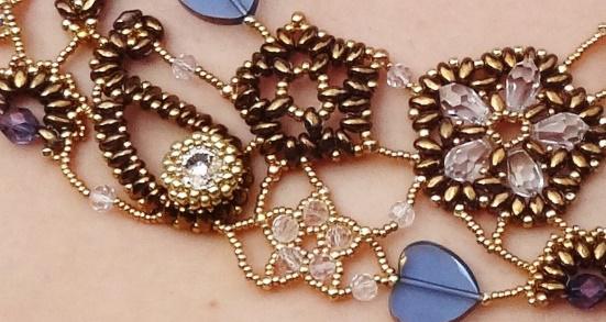
Paisley Lace Necklace
This piece includes duo beads in crystal gold (looks purple when held to the light), and seed beads in two more different shades of gold.
Another, more useful to the beader, use for colour blending is the situation where you may need to mark out certain beads within a pattern so that you can see where you are, for example in Cubic Right Angle Weave (CRAW) , which can be complicated to learn. Here’s an example where I have used light gold beads for the CRAW framework, and darker gold beads to fill the gaps.

CRAW Diamond Pendant
All of these examples are using coloured that are quite close together on the colour wheel . Try to avoid blending complimentary colours , as these will cancel each other out and just create a muddy colour!
I hope that this has inspired you to try some colour blending!


